“I Don’t Know Exactly What I Want, but I’ll Know it When I See it”
We know that its hard to articulate your vision for your website. Here is a list of some of the best 2018 & 2019 website trends and themes to help inspire you. There’s something for everyone in this list. Every one of these layouts will allow us to deliver a custom look, feel and flow for your website. We specialize in “custom and unique”.
1. Super Effects & Great Theme for About Any Service Industry
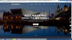
Almost everyone likes eye-catching browser effects and this demo supports awesome header blending and fades as well as call-outs that help to describe your company’s strengths. There are parallax screens, awesome galleries that can show of recent work or products, and the front page actually supports everything to promote your firm including testimonials, video, team, etc.
Using changing HEADERS (even with video) allow for great Call-to-Action to push visitors to important service or product pages.
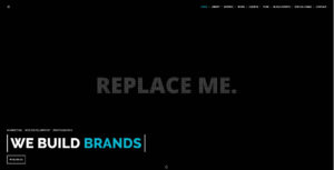
Don’t let this theme fool you. Every place that you see “replace me” is an opportunity to show off and promote YOUR imagery and content!
This theme demo shows off how you can get all of your content delivered on one page so that visitors get everything you want them to see in one click. If you click around the “navigational page links” you’ll see that it simply drops visitors to that content on one scroll. This is a huge plus to mobile visitors who are using their thumbs to navigate the content.
A great new trend in 2018. The platform still allows for SEO pages, BLOGs and more to grow your website for SEO.
3. Inspriring Design. Great Layout for Any Business!
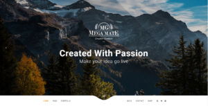
We like this layout so much because it shows off the latest trend of asymmetric design. There’s nothing boxy about this layout. We like it so much we are developing our own, newest AppnetNewMedia.com website with it. The platform allows for SEO pages, BLOGs and more to grow your website for SEO.
This layout is easy to create a truly customized look and feel for any business by implementing your message, your high rez imagery and more!
4. MrSEO. Very Flexible Layout…
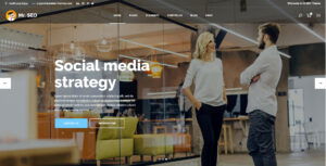
This layout is called MrSEO for a reason. While it has a great layout and tons of promotional content on each page, it is also awesome for SEO. Okay, in reality, all WordPress layouts are awesome for SEO!
This layout is really great due to the flexibility of design features. It is also one of the more popular layouts of 2017 and 2018 as it allows for great promotional components like team bios, reviews and more.
This layout might be called “Mr SEO” but it could easily be called “Mr Flexibility”.
5. Super eCommerce Layout with Lots of Options
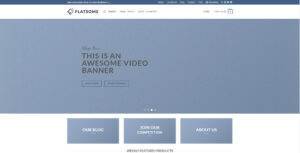
This theme layout is called “Flatsome” but there’s nothing flat about it. There has been a growing tidal wave of flat designs on the web, and recent trend reports have confirmed that they’re only increasing in popularity. Don’t know what “flat design” is?
You should because it is a growing trend to deliver crispness and clarity that can only be achieved by stripping away three dimensional effects. In its essence, flat design has two objectives: Embracing the limits of the screen and working within those parameters rather than trying to disguise them.
Using this newfound simplicity as a starting point for streamlining designs, and making websites faster and more functional. Click some of the DEMO options in the top NAV, as well as the SHOP, pages, etc. You’ll have to imagine what this layout looks like with all of your imagery, text, products and more. However this is a robust layout with great SEO.
6. We Can Whip Your Website into Shape! Check out this theme for Fitness & Coaching
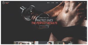
We receive a LOT of request to build websites for personal trainers and fitness coaches. If this layout won’t inspire you to hire a coach, nothing will. There’s plenty of room for videos (scroll the front page) and more.
Image is Everything with every business and your website needs to reflect the best of your services and products. This layout does that in spades.
There’s tons of growth for team bios, reviews and more! If you’re a one-person show, we can tailor the delivery of content accordingly.
7. Great Layout for Builders, Contractors, Landscaping, Plumbing & All Service Industries
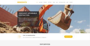
We build so many websites for contractors of all ilk, shapes and sizes. This layout, called Renovate, offers the perfect blend of content that shows off your company’s services in a clean, mobile-friendly design.
There’s plenty of room for display individual service pages that more effectively promote diverse areas of expertise and construction-related services.
You can also share recent project imagery, before & afters, etc. This layout is very popular.
8. Another Awesome Construction Based Layout!
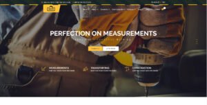
Building a website is a lot like building a home, or a structure of any kind. You need a great foundation and this layout has that and more!
This layout allows you to get everything on one page – which is great for mobile and yet there is great navigational growth for content pages that help to provide your services, team bios, reviews and more.
The portfolio gallery offers a ton of flexibility to show off your latest work and recent projects.
9. Landscape, Construction, Services Layout! HOT!!!
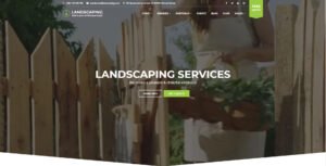
Why is this layout so hot?!?! Click to check this layout out yourself as this delivers some awesome video headers and features to promote your business better than most in your industry and coverage area!
This layout allows you to get everything on one page – which is great for mobile and yet there is great navigational growth for content pages that help to provide your services, team bios, reviews and more.
There’s galleries and promotional call-to-action and more!
10. Real Estate Layout with Lots of Room for Growth!
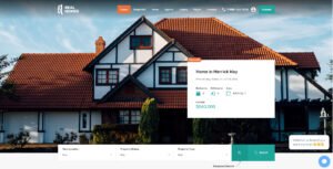
Appnet has designed literally thousands of real estate websites in our 23 year history. From single realtors to large firms, real estate websites have to deliver listings and more to inspire calls and email leads for you.
Having an awesome looking real estate is great, but if isn’t ranked on Google, it is like pretty up a gorgeous billboard on a dirt road somewhere. Appnet ranks in the top three on Google for “guaranteed search engine ranking” and more.
This layout delivers the look and the tools for success!
11. Real Estate Layout with Wow!
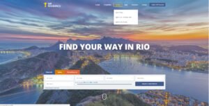
Appnet has designed literally thousands of real estate websites in our 23 year history. From single realtors to large firms, real estate websites have to deliver listings and more to inspire calls and email leads for you.
Having an awesome looking real estate is great, but if isn’t ranked on Google, it is like pretty up a gorgeous billboard on a dirt road somewhere. Appnet ranks in the top three on Google for “guaranteed search engine ranking” and more.
This layout delivers the look and the tools for success!
12. Cutting Edge Layout Called “Blade”
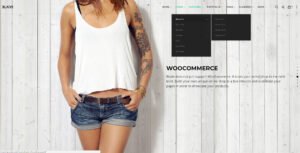
“Blade” is cutting edge because it displays your header graphics in a unique, flip style that can be used to really show off your products, online store and more.
The image-flip style is unique, but great for mobile.
This layout still allows for all of the additional pages that you might want or need, and as with all WordPress layouts – Google loves the SEO value.
13. Great Layout with Video & Parallax
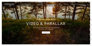
Video headers are the rage! Combining that effect with parallax layout techniques is a cut above the rest!
This layout is not just about “looking pretty” as it provides great parallax effects but with the ability to add page navigation to grow any number of content pages that you might want or need for promotional needs as well as for SEO.
Great visuals and function!
14. Websites Good Enough to Eat!
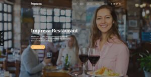
Restaurant websites should show off their menu so well that visitors can almost smell the food. This layout does a great job of allowing us to do just that!
Imprezza is one of the most popular WordPress layouts and we can custom-design this to show off your restaurant, with menus, reviews and even the ability to order online.
As with all WordPress layouts, this theme is very customizable, mobile-friendly and Google, SEO friendly.
15. eCommerce! Awesome Options!

Enfold is a great WordPress layout that combines the best options and control of WordPress and the robust features of WooCommerce!
As with all WordPress layouts, this theme is very customizable, mobile-friendly and Google, SEO friendly.
eCommerce stores come in all shapes and sizes. Call us for a custom quote.
Appnet can help you easily import all of your products from an older, existing store – saving you tons of time and money!
16. We All Care About Children!
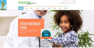
Appnet receives a lot of inquiries for building websites for schools, doctor’s offices, and other professional services.
Here is a great example of a nice pediatric website client website. The layout is totally custom, directed totally by the client. The entire website is easily managed through the WordPress CMS.
WordPress is the platform that nearly 60% of all new websites are built on. Google loves it and so does, Forbes Magazine, Facebook’s own BLOG and more!
Be All That You Can Be! Here’s 300 More to Choose From.
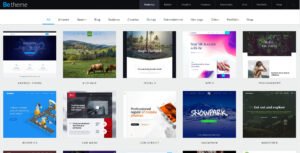
If you haven’t seem something you like yet, then check out these! Here are 320+ more layouts that fit about every business model.
If you can’t find a layout from these, then you’re not looking!
Simply click around, find one you like and convey that to our team and we will get about gathering your content and input, and custom design things just for you.
Large Enough to Handle Any Size Project; Small Enough to Give Personal Care…
Appnet New Media Studio’s team consists of 16 experienced and professional web designers, developers, programmers, content writers and support specialists. That makes us just large enough to take on even the largest and most complicated projects – and yet we are small enough to give you the kind of personal attention that you deserve, no matter how small or large your project or budget is.
We’ve been in the business of web design for almost 23 years now and in that time we’ve learned a lot about how best to work with our clients – particularly when it comes to creating a “wow-factor” website – as well as one that is productive in creating new customers and clients.
“Top Website Trends”
Everyone wants their website to be unique, custom, interesting and creative. However, one of the most common comments we hear from new clients is that they really don’t know what they want – they just want something that moves them.
With that in mind, we have created this list of some of 2017-2018’s best and latest trends that you’ll probably want to think about and/or include in YOUR new website:
- Web Animation – Eye catching effects like movement on the screen on mouse-overs have gotten huge – again.
Animated logos are an obvious trend, and one that gives a company a big opportunity to enhance their brand further.When you combine the availability of animation tools with browser improvements it’s easy to see why animation is going to be big in 2018.
“Does it enhance or otherwise contribute positively to the experience? My heart sinks when a client approaches me saying they want to ‘sprinkle animations all over our app’. Shoe-horning an animation into a design rarely ends well because the animation has no purpose other than to titillate.”But there’s no arguing – when it’s done well, animation can transform a good project to a great one. Just don’t overdo it. - Illustration – Everyone wants ‘custom and unique’ and one of the best ways to do that is to use illustrations in your designs. Illustrations can be extremely practical ways of presenting or explaining information. Nobody wants a boring website, and custom drawings are a human touch that can breathe life into otherwise dry content.
Interactive Communication – Chat bots are seeing a huge return to websites. Several years ago these were just popup boxes that showed up after you were on a webpage for a bit. Now they are more robust and can even interact with prospective clients in new and exciting ways. Chat features are great for helping to convert visitors to new customers.As people become more accustomed to interacting with bots, we are seeing a rise in the use of conversational interfaces in design.
- Asymmetric Designs and Layouts – We probably hear this from prospective clients and even our own team here at Appnet. Nobody likes “boxy” websites. About five years ago when the responsive design movement ramped up, designers had to make certain that websites “redesigned themselves for mobile devices, etc.Over the last year, we’ve seen an increase in designs that rebelled against the constraints of responsive design with an attempt to be more ‘creative’. Again, client want their website to be ‘less boxy’ and all top design firms have responded. New technologies and design platforms meant that NOW traditional ideas of web design are being broken – left, right and center!
- Mobile, Mobile, Mobile – The percentage of web traffic going mobile continues to climb. 2017 was THE YEAR for the mobile web, as its usage finally surpassed that of desktop browsing. That means that your website has to have a large focus on your mobile audience.
- eCommerce is cheaper and better than ever – …and becoming a part of non-traditional eCommerce websites. In other words, even if you don’t have products to sale, you can still incorporate the ability to accept payments on your website or sell gift certificates, etc. We’re only just beginning to see the possibilities of eCommerce as we are moving away from the traditional storefront-on-the-web business model.

 Interactive Communication – Chat bots are seeing a huge return to websites. Several years ago these were just popup boxes that showed up after you were on a webpage for a bit. Now they are more robust and can even interact with prospective clients in new and exciting ways. Chat features are great for helping to convert visitors to new customers.As people become more accustomed to interacting with bots, we are seeing a rise in the use of conversational interfaces in design.